Designing a store layout is part art and a lot science. Understanding the theory behind common store layouts will give you an important grounding before you go on to design your own. We’re going to walk you through some proven store layouts (with diagrams!) and best practices, as well as guiding you on what might be right for you.
🙌 But first, a huge shout-out to the book Store Design and Visual Merchandising: Creating Store Space That Encourages Buying, which we found a really useful resource when assembling this guide.
On this page
- 6 Popular retail store layouts:
- Tips for an effective retail store layout:
- But remember! Your data is all that matters
6 Popular retail store layouts (with diagrams)
Before you start putting up shelves and setting up tables, take the time to sketch out a layout. Here are six proven store layout templates you can take inspiration from:
1. Forced-path layout
-3.png?width=600&name=(1)-3.png)
🏆 Best for: Large retailers who are able to monitor footfall patterns carefully, and rely on impulse purchases.
A forced-path layout ‘forces’ customers to walk through the entire store before getting to the till. Two well-known examples of retail stores using this format are IKEA and Flying Tiger.
It’s a pretty bold choice. Yes, a forced-path layout allows you to expose customers to literally every one of your products. Yes, you can completely curate their journey through your store. But it’s also going to be pretty aggravating for most people. IKEA side-steps this to some extent by adding subtle ‘shortcuts’ at certain points in the journey.
2. Grid layout
-1.png?width=600&name=(2)-1.png)
🏆 Best for: Large, practical stores, like supermarkets or DIY shops.
Most of us are familiar with a grid format. This is the layout you’re most likely to see in a supermarket, DIY store, or any other large ‘practical’ shop.
It’s designed with a simple goal in mind: to help you find what you need, fast. Sure, there’ll be offers on the end of the aisles, and impulse purchases at the checkout, but it’s not really designed for browsing, or shopping for pleasure.
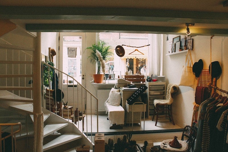
3. Free-form layout
-1.png?width=600&name=(3)-1.png)
🏆 Best for: Smaller independent lifestyle shops
Independents, your time has come! Free-form store layouts — as the name suggests — don’t follow such a strict layout. It’s an option that has become a lot more popular in recent years, as shops strive to make buying in store an ‘experience’ rather than another chore.
The idea is to create several points of interest, all while leaving the customer plenty of space to carve their own path.
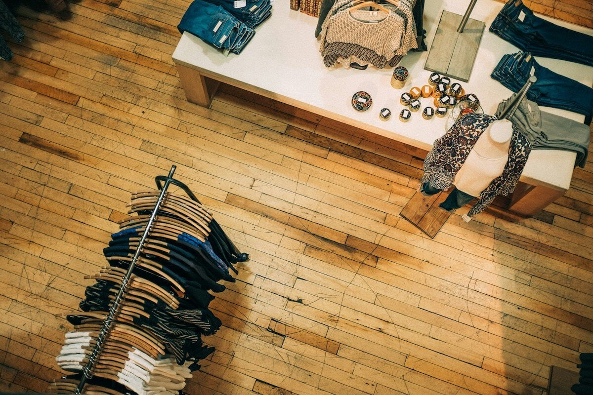
4. Boutique layout
.png?width=600&name=(4).png)
🏆 Best for: Smaller clothing boutiques
The boutique layout is ideal for clothing shops. By clustering products by type or trend, you can create four (or more) distinct shop feels within one.
Remember, if a customer feels overwhelmed, they’re not going to browse for as long. Dividing the merchandise in this way makes your store feel a lot more approachable.
The caveat to this, of course, is that your store needs to be large enough to achieve this without feeling claustrophobic. If it’s not, you’ll end up with the opposite effect.
5. Loop/racetrack layout
-1.png?width=600&name=(5)-1.png)
🏆 Best for: Small or narrow stores, record shops
The loop layout — also known as the racetrack layout — is a slightly smaller-scale, less irritating version of the forced-path layout.
In the case of smaller stores, this layout can come down purely to practicality; if you only use a narrow product display in the middle, it’s the most space efficient of the six.
6. Angular layout
.png?width=600&name=(6).png)
🏆 Best for: Luxury shops
The angular layout is the only one to use purely stand-alone displays. Overall it’s likely to display fewer different items — both in terms of volume, and number of SKUs.
Done well, this evokes a feeling of luxury, or something very unique. Glossier is a prime example of this. In terms of price point, it’s not a luxury brand. But the stores are a masterclass in experiential shopping. And the product catalogue is pretty small in size relative to the square footage of its centrally-located stores.
6 Key tips for working with customer flow
Whichever store layout you decide on for your store, here are a few science-backed need-to-knows to hold in mind as you decide on the finer details:
1. Work anticlockwise
Whatever layout you choose, you'll notice people tend to prefer to walk anticlockwise around your store. So don’t hide your best products on the front left!
2. Leave a big enough transition zone
The transition zone is the area immediately after a customer crosses over the threshold into your store, but before your first table, shelf or display.
It’s important that your customers have plenty of room at this stage (it’s actually also sometimes called a decompression zone, and the clue’s kind of in the name). Their tolerance to feeling cramped at this point is particularly low — if they do, they won’t stay as long (or even enter in the first place).
We asked Sarah Manning, a Visual Merchandising Consultant and Lecturer, what smaller stores tend to get wrong when it comes to their layout and merchandising:
“Typically they tend to have too much out, so the quantity is probably wrong. If it's so heavy with product quantity, firstly it undervalues the product, and secondly, it makes it unshoppable. But if it’s too empty it can look like it’s been overshopped, so it’s all about the correct quantities and making sure it’s shoppable.”
She also finds the experience of shopping at smaller stores is often a bit cramped.
“I think often the floor layout can be slightly wrong. Particularly with smaller store, often it's quite cluttered, with lots of blocks to block the flow.”
She stresses the importance of creating a calm space for your customers, monitoring how they move through your store, and making adjustments as needed.
📚 Bookmark for later: Visual Merchandising Fundamentals, with Sarah Manning
3. Avoid narrow aisles
Your customers hate being crowded at the point of entering your store, but they don’t exactly like it at any point. ‘Roomy’ should always be the goal. Cramped corners or aisles simply won’t get a look in, and also exclude people with wheelchairs or pushchairs.
4. Keep people on the same floor where possible
Customers are typically much happier to stay on the floor they come in on. Going down into a basement is particularly unappealing. Consider this when choosing your retail space, and when deciding on the layout. If you have to use a second floor, make sure it’s well signposted, and don’t put your best stuff up/down there.
5. ‘Eye level is buy level’
Customers are most likely to buy products which are positioned at their eye level. The next most popular level is the ‘touch level’, which is just below. We think this level can actually be better for tactile products, like very soft toys or jumpers.
6. Shoppers scan horizontally to find product type
And they then prefer to find the specific product by scanning vertically. So if you arrange your products by type, do this in ‘columns’ rather than by shelf.
7. Put impulse purchases by the checkout
It's the oldest trick in the merchandising book, but it still works! Place your lower value items, like chocolate bars or keyrings, beside the checkout. Customers are more likely to impulsively swipe one when they're at the point of payment.
📚 Bookmark for later: 16 Tried-and-Tested Retail Merchandising Tips
But remember! Your data is all that matters
You can (and should) hold science-backed best practices in mind when designing your small retail store layout. But it’s only when you start monitoring how people actually behave in your store that the real lightbulb moments will happen.
So how do you monitor what’s working? Larger stores invest in people tracking systems to plot each customer’s route, and count each person in and out of the store.
If you don’t feel ready for that stage, there’s a lot you can observe yourself. Where do people spend the most time? What captures their attention when they first step through the door?
FAQs
1. What are the main type of store layouts?
In theory, the number of different store layouts is infinite! In this post we’ve focused on what we believe are the six most important and most common ones; forced-path, grid, freeform, boutique, loop (also known as ‘racetrack’), and angular.
2. Why is a store layout important?
Lots of reasons! A good store layout helps your customers feel at ease, helps them find what they’re looking for easily, and also encourages them to pick up products they perhaps didn’t know they needed. It puts your bestselling (or highest margin) products in prime positions, and generally helps set the vibe of your store.
3. How do you plan a store layout?
Start by deciding which store layout template would work best for you, and use this as a springboard for your own design. Sketch out a layout using a pencil and paper. Order any necessary props, put up your shelves, and voila! Just don’t forget to keep monitoring how people behave and move in your store, and adjust your layout accordingly.
4. What is customer flow?
Customer flow is basically the way customers move (or 'flow') through your store. To some extent, how you lay out your store can dictate this — in each store layout example above, we've plotted the route we've expected the customer to take, but it's important to monitor how this plays out in practice, and rearrange things as needed.
👋 Not registered with CREOATE yet? Sign up now and shop wholesale with us today.
Read more:
- Top 6 Window Display Ideas
- What is RRP?
- What is an EORI Number?
- 11 Shopfront Signage Ideas
- 11 Best Scandi Wholesale Homeware
- 12 Best Quirky Wholesale Homeware Brands
Browse Popular Categories at CREOATE: Wholesale Jewellery | Wholesale Gifts | Wholesale Stationery | Wholesale Beauty Products | Wholesale Mugs | Wholesale Homeware | Wholesale Pet Supplies | Wholesale Gourmet Food | Wholesale Garden & Outdoor | Wholesale Baby & Kids Products
Browse Trending Collections on CREOATE: Wholesale Halloween | Wholesale Mother's Day Gifts | Wholesale Father's Day Gifts | Wholesale Valentine's Day Gifts | Wholesale Spiritual Supplies
>> View all