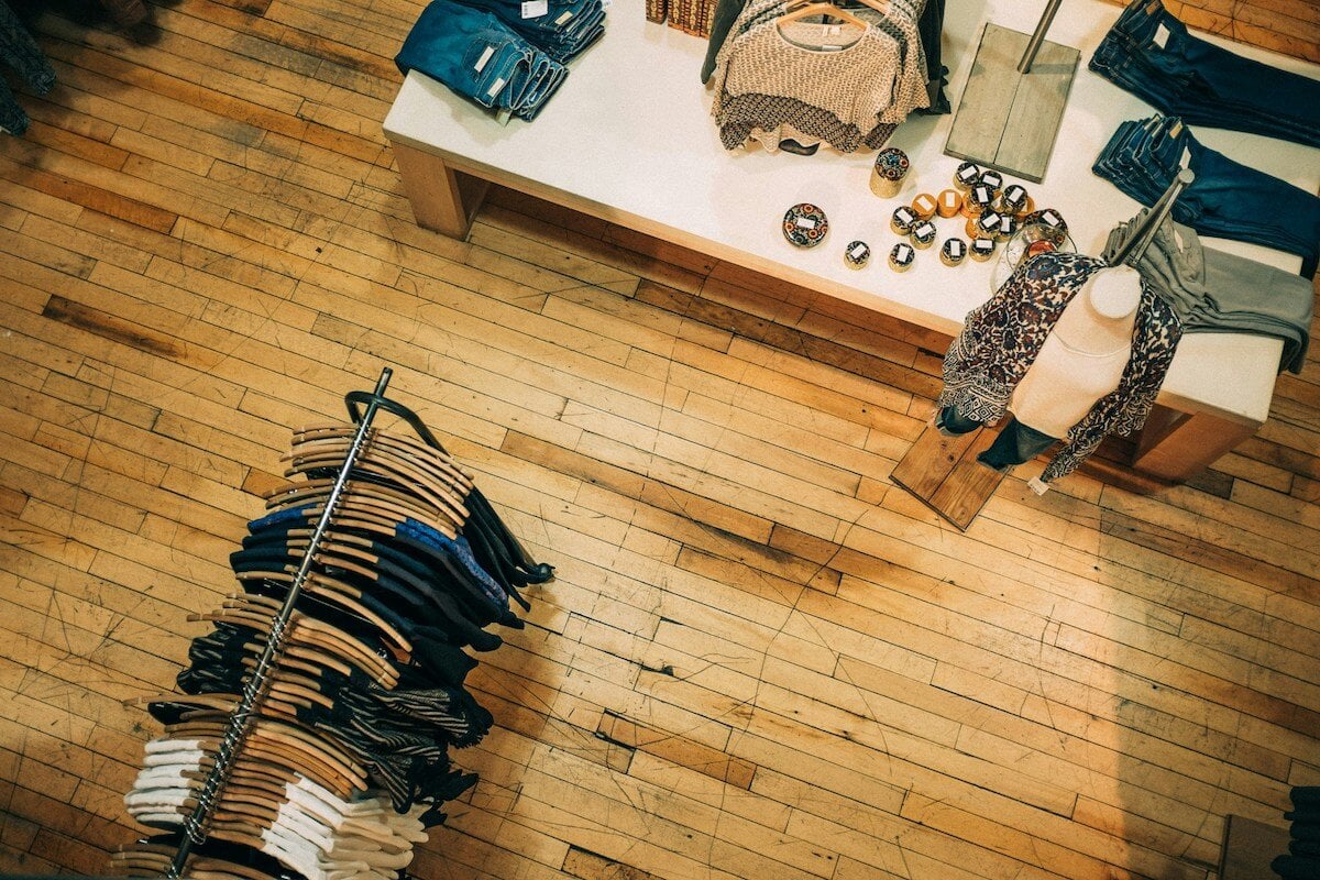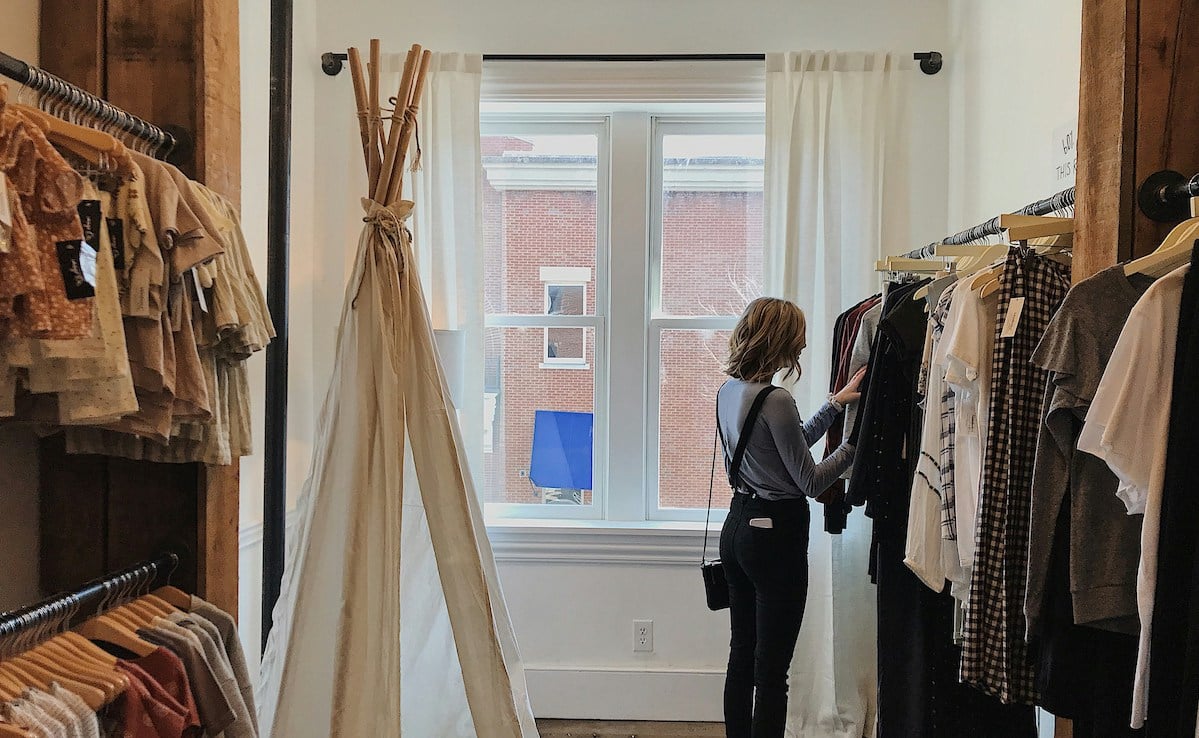
Visual merchandising is all about the ‘look and feel’ of your store, and how you can use it to encourage sales, all while delivering the best possible user experience. It forms part of your retail merchandising strategy, which is all about the way you choose, display and market your products.
When visual merchandising is done well, your store will look inviting to people passing by, be easy to manoeuvre around and navigate, and people will feel comfortable spending time browsing your products.
When it's done really well, their shopping experience will be a truly memorable one, and they’ll be keen to return and to spread the word. Here are our 20 top visual merchandising tips to keep in mind when laying out your retail store.
👋 Great visual merchandising starts with a great product assortment. Shop over 6,500 independent wholesale brands on CREOATE
20 Visual merchandising best practices for retail:
- Put your sale at the back, and new stock at the front
- Put 'need' items at the back, too
- Vary your product hierarchy
- Display the same products together vertically
- Cross-merchandise where you can
- Pick an appropriate store layout (we like the Boutique layout)
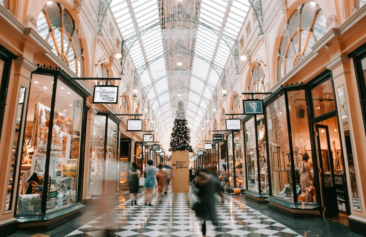
- Create a signature store scent
- Shake up your window display
- Rotate products regularly
- Add impulse products at the checkout
- Leave enough space
- Put tactile items on tables
- Tell a story with your displays
- Get your internal signage in order
- Use the Rule of Three when displaying products
- Plan for key calendar moments
- Use warm lighting
- Create social appeal
- Set the right tone with your playlist
- Pack a punch with your shopfront
1. Put your sale at the back, and new stock at the front
Let’s kick off with a basic one. When planning the layout of your store, put new items towards the front, and your sale at the back. For one, sales can look messy, so are best kept out of immediate view. And second, if you’re advertising a sale in the window, customers will have to walk through the whole store — and view all your stock — in order to reach it.
Having your newest items at the front of your shop is a good rule of thumb, too. You’ll naturally switch this up fairly often, so you’ll be more likely to catch the attention of regular passersby.
2. Place 'pull' items at the back, too
It would be easy to assume that your best selling products should get the priority treatment (being placed closer to the front of the store, at eye level, or on tables instead of shelves), but this isn’t always the case.
If you know customers mainly come to your store to buy something they need, and which they know you sell, this is what's known as a 'pull' product.
As Sarah Manning, a Visual Merchandising Consultant and Lecturer explained to us:
“Push products are the products you really want to show off first. They’re usually new, seasonal, or maybe have a higher price point. These products should always be at the eye line to draw the customer’s eye to that product first.
Pull products are the products that 'pull' the customer to have a look for them, including core merchandise products that people are always coming in for, or products with cheaper price points.
These products should be placed on lower shelves or tables, or towards the back of the store.
On the journey to those pull products, showcase and highlight to the customer those push products that they haven't come in for.
Always prioritise what you want to show first at the eye line, because all customers are naturally going to look there first."
📚 Bookmark for later: Visual Merchandising Fundamentals, with Sarah Manning
3. Vary your product hierarchy
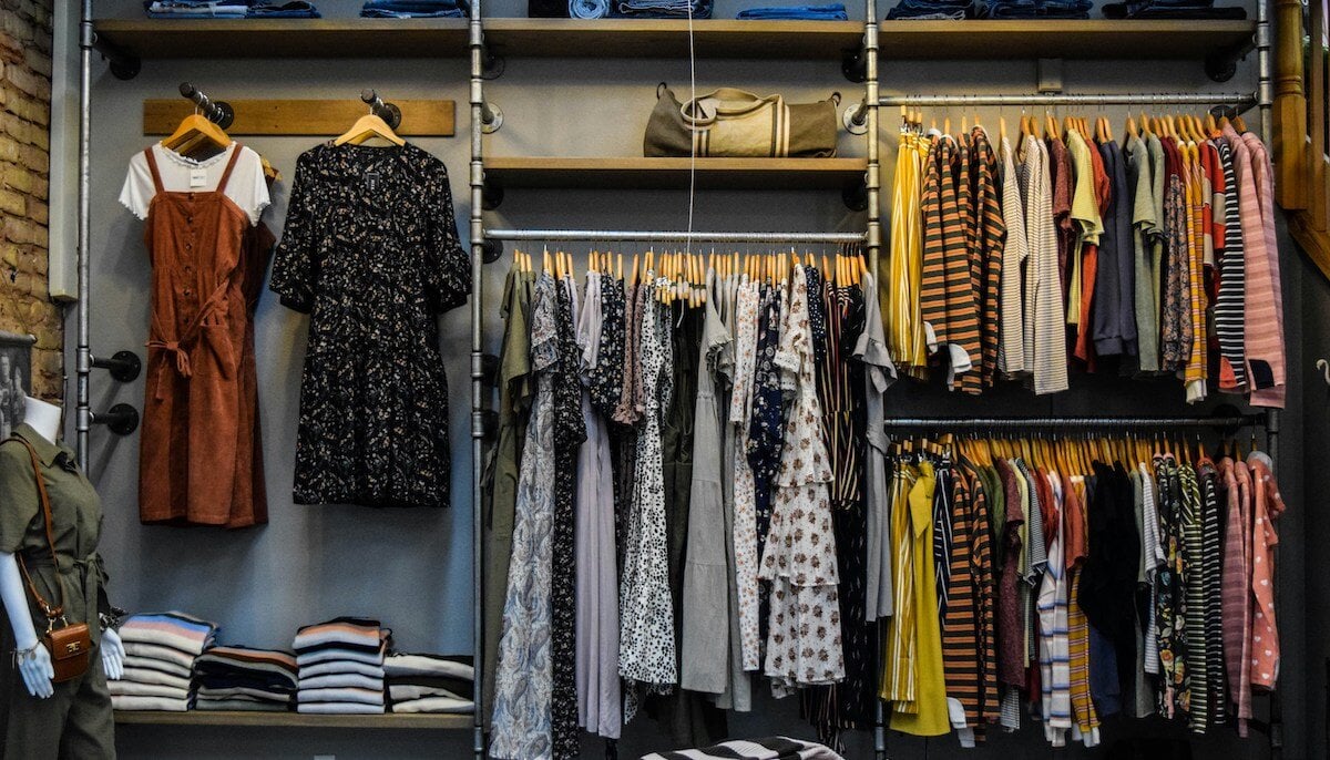
To keep your store visually appealing, think about how you can display products on several different levels. Shelving, tables, the floor… mixing it up keeps the customers’ eyes busy and engaged.
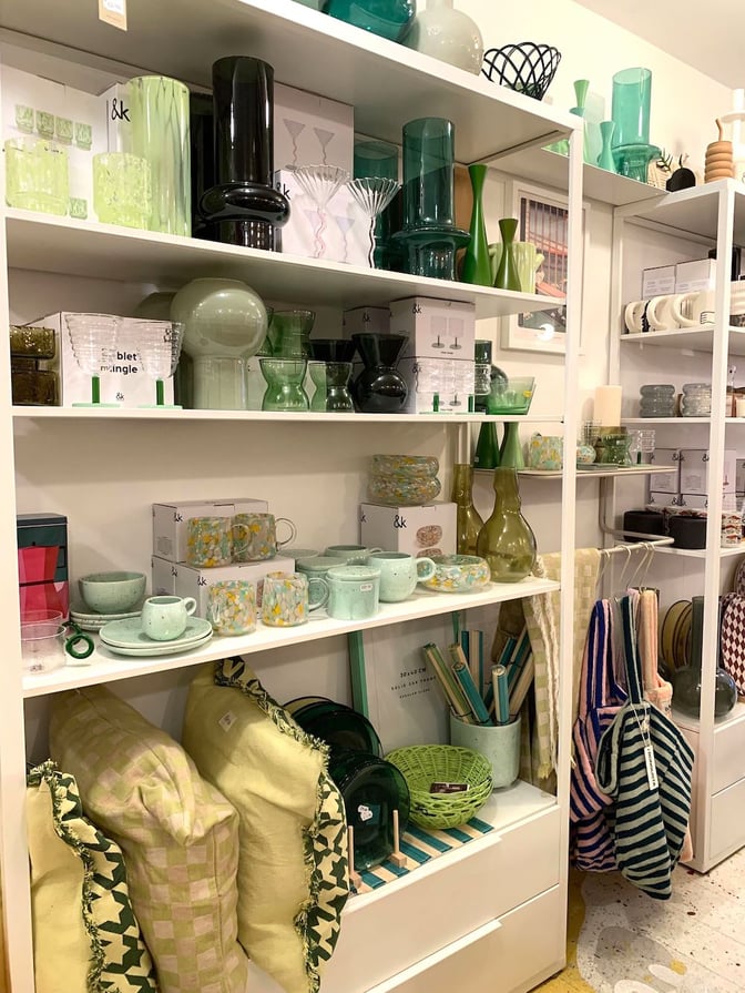
📍Dowse, Brighton, UK. Dowse's products cover their walls from floor to ceiling, but it's all curation and no clutter
4. Display the same products together vertically
People tend to scan horizontally to find the 'type' of product they're looking for (e.g. socks), and then vertically to find the specific product (e.g. red socks, size large). So where possible, arrange your stock to work with this natural searching pattern.
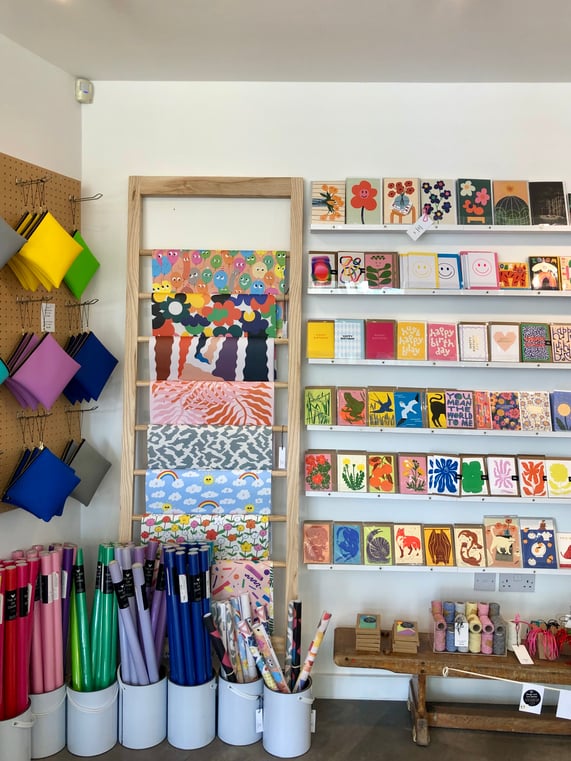
📍Lift Store, Southwold, UK. We're basically never *not* looking to Lift Store for our retail merchandising inspiration, and you can see why!
5. Cross-merchandise where you can
When deciding on how to group your products, and where exactly to put them within those groups, also keep cross-selling opportunities in mind.
This means keeping complementary products together — so if you’re selling candles, it would make sense to keep matches nearby, and candle holders. This way it’s more likely a customer will buy more than one thing at once.
6. Pick an appropriate store layout (we like the Boutique Layout)
Use an established retail store layout as a springboard for your own. These layouts are all designed to help customers flow seamlessly through your store, while seeing as much of your product assortment as possible.
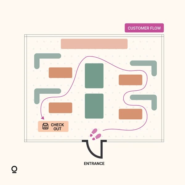
While different layouts work better for different store types and sizes, the 'Boutique Layout' is a pretty failsafe option for smaller independent retail stores.
📚 Bookmark for later: 13 Retail Store Layouts & Customer Flow Tips
7. Create a signature store scent
When we talk about retail merchandising, a lot of what we discuss is about the visual side of things. But there are four other senses which you shouldn’t leave neglected.
If you’ve ever shopped in Hollister or Abercrombie and Fitch, you’ll notice how the experience is a pretty immersive one, and a big part of this is the scent which is pumped around the entire store.
Playing with scent in this way is risky as people may find it overwhelming, but when it pays off, it works really well — not only will the scent always evoke the memory of your store, but it also works as a great ad for whichever scent you’re using (in the case of Hollister, the room is sprayed with a condensed version of aftershave ‘Fierce’).
8. Shake up your window display
Your window display is probably the most important consideration when it comes to your retail and visual merchandising; it’s what’s going to turn a random passerby into a potential customer.
Here’s how Laura from Handmade Design, Ashbourne, puts together an eye-catching display for her shop:
“Planning our shop window displays is one of my favourite jobs! To keep things fresh, I try and change our shop window display every few weeks, even if it’s just a case of changing the smaller pieces. When I’m planning a shop window display, I will always try and think of a theme... Before I even begin playing with the window display, I simply sit down with a pen and paper and write down all the products that I feel would fit to my theme.. Once I’ve put a list together, I go through it to make sure we have a good mix of product types and sizes. Once I’m armed with my list, I put the large pieces in first (for us it’s furniture) and then I just start playing to see what works!”
— Laura, Handmade Design
📍 Handmade Design, Ashbourne, UK. As you can see, Laura is a real window display pro!
📚 Bookmark for later: 21 Window Display Ideas & Design Tips
9. Rotate products regularly
Following on from Laura’s advice above, it’s great to refresh both your window display and the front of your store as often as possible. While it’s not a great idea to move fixtures around too much (you want to keep the basic structure for continuity), you should switch up the order of the products, and bring new ones to the front.
10. Add impulse products at the checkout
We’ve all been there: one minute you’re standing in a queue at the supermarket with your groceries, and the next a bar of chocolate has *slipped* into your basket.
Impulse purchases are definitely a thing. They don’t have to be edible, but they should be small, and fairly cheap (a few pounds, max). Lip balms, pens, keyrings…these are all things worth keeping close to your till.
✨ Shop now: Wholesale impulse buys & POS displays
11. Leave enough space
So you’re busy turning your store into a sensory sensation, with products from floor to ceiling. Now’s the time to make sure you’re leaving enough space.
Firstly, this is pretty essential from an accessibility point of view. You need to make sure your customers have enough space to move comfortably around your store — that means enough room for wheelchairs, pushchairs, and for social distancing.
It’s important to leave some ‘dead’ space at the very front of your store, too. This gives customers room to ‘decompress’ as they enter your shop, or leave it. Otherwise, the space can feel intimidating and claustrophobic. You want customers to be able to walk in, pause, and decide where they’d like to start out.
12. Put tactile items on tables
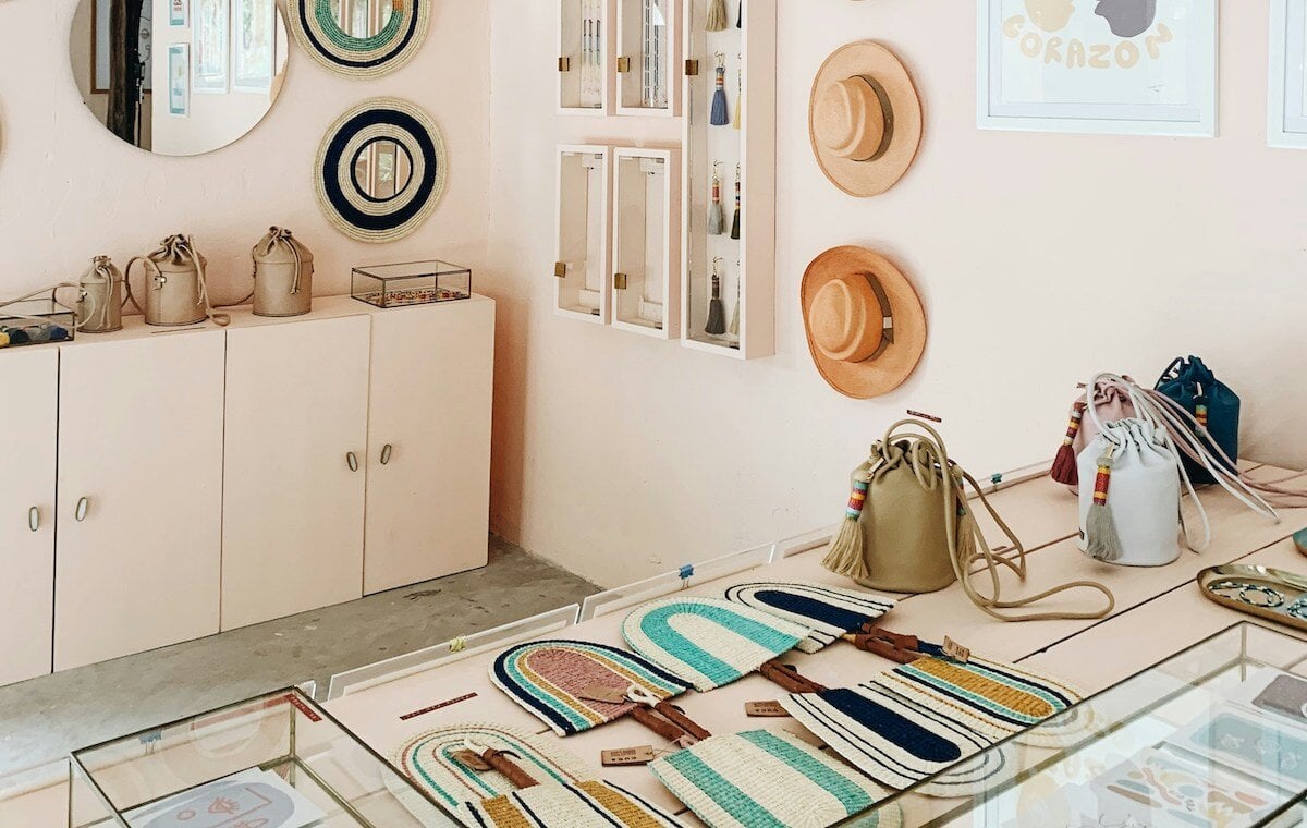
When merchandising your store, use your tables for your fluffiest jumpers, crispest stationery and softest socks… essentially, anything for which touch is going to encourage sales. People naturally reach for products which are on tables because they’re a reflection of their own home setting, so use this to your advantage.
📍Search & Rescue, London, UK. Search & Rescue's table is always full of beautiful stationery. You can’t help but pick up their crisp notebooks and leaf through them
13. Tell a story with your displays
It’s easy to panic at the mention of storytelling in visual merchandising. It sounds more complicated than it actually needs to be.
Sure, larger retailers might go to town with store-wide themes and all-out window displays to match. But in reality, the concept of storytelling is much easier to execute on.
Let’s say you’re selling throws and cushions. Placing an armchair in the corner of your store with one of the throws draped over it, and a cushion plumped up in the middle, will help your customers to imagine these items in their own home, and make it more likely they’ll go on to buy them. Storytelling doesn’t have to be flashy or even very creative; it can be subtle, simple, and still highly effective.
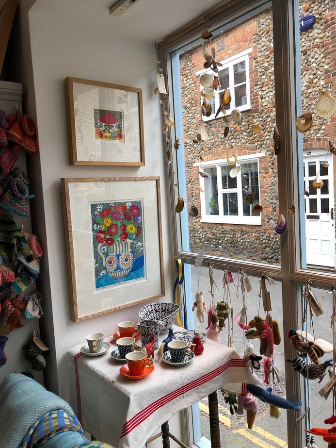
📍Verandah, Holt, UK. A simple table perched in a little alcove of the Verandah store is all it takes to bring these delicate cups and saucers to life
14. Get your internal signage in order
Do you find customers are often asking you where the fitting rooms are, or the greetings cards, or the tills?
You want there to be as little friction as possible between your customers entering your store and making a purchase. And yes, asking someone is simple enough — but being able to find your own way with clear (and ~fun~) signage makes for a much smoother experience.
📚 Bookmark for later: 13 Creative Shopfront Signage Ideas to Try
15. Use the Rule of Three when displaying products
Whether it's three mannequins in your shop window, or a cluster of three vases on a shelf, the human brain loves seeing things in three; it helps us process and compare what's in front of us without feeling overwhelmed, it's pleasingly symmetrical, and it doesn't leave products 'floating' awkwardly on their own.
16. Plan for key calendar moments
When it comes to prepping your store for key dates in the year, time and organisation are both really key. A last-minute, half-hearted attempt at decoration can sometimes be worse than nothing at all.
But we’re sure you know this already. What you might not have considered are the less obvious holiday dates.
For example, for International Women’s Day, how about dedicating your window display to female-owned brands? Or to LGBTQA+-owned brands during Pride month?
📍Harriet & Rose, Jersey, UK. We love this window display by Jersey-based store Harriet & Rose, which created a rainbow out of existing products as a nod to Jersey’s Pride event
17. Use warm lighting
Get the best out of your now expertly-merchandised store by making sure you light everything well. And remember, lighting everything well doesn’t mean lighting everything super brightly. Rather, you want a nice, warm yellow lighting, with key areas of your window and in-store displays picked out with spotlights. If any areas are looking a bit dark, try adding a lamp.
18. Create social appeal
We’ve left this one last because it’s…hard to put your finger on. But what we basically mean here is feature something within your store (or the outside of your store) which people naturally want to post about.
A great example of a brand doing this *unbelievably* well is Glossier. The pastel pink stores, the pink jumpsuit-clad store assistants, the infamous ‘Glossier canyon’, the simplicity of the ‘You Look Good’ on the mirrors… we could go on. Everything in Glossier is crying out to be 'Instagrammed', and that has undoubtedly played a huge part in their 2.7m following. It also gives Glossier a huge mine of user generated content to use on their own platforms.
📍Glossier, Seattle, USA. Glossier’s Seattle store is completely and wonderfully surreal
We could wax lyrical about Glossier all day, but let’s get back to your shop. We’re not expecting you to build a canyon, or paint the whole thing pink. But how about a really beautiful display of dried flowers? Or a fun slogan in a neon light?
19. Set the right tone with your playlist
Music is another key (and often overlooked) consideration. 70% of people claim to be more likely to shop in places that play the music they like, but there are subtler forces you can tap into here, too. For example, a scientific experiment found customers in a wine shop bought more expensive bottles of wine when classical music was playing.
How you want people to feel in your shop? There’s a reason bookshops play slow acoustic or jazz rather than loud, up-tempo pop; they know they’ll make more sales when people feel comfortable taking their time, and browsing. For other stores, louder and faster music creates a fun feeling that’s more on brand.
20. Pack a punch with your shopfront
Your shop window isn't the only way to catch eyes; don't forget about your shopfront itself! Forest and the Flowers stands out from right down the street, even on a grey morning like this one was.
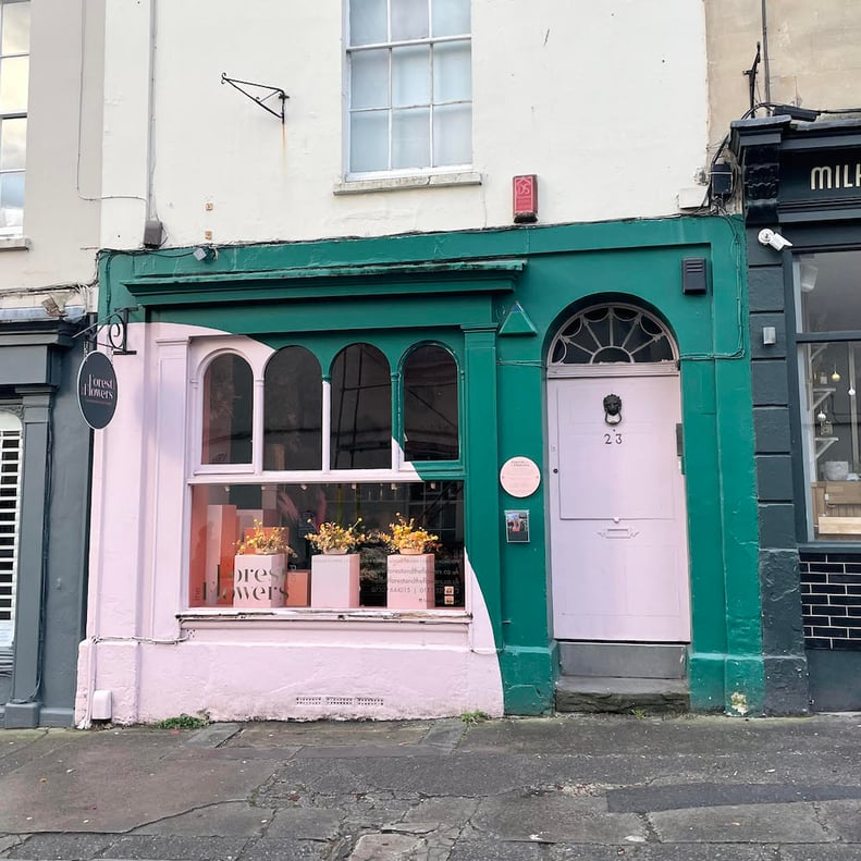
📍Forest and the Flowers, Bristol, UK. Absolute shopfront goals
Final thoughts
After reading this post, we hope you feel much more confident in arranging your store. But the most important thing is to stay flexible, and keep learning; even very well-established brands like Glossier will need to tweak their layout as they learn from their customers, and their needs.
Finally, we’d love to hear from you: do you have any visual merchandising tips we missed? Any tried-and-tested techniques to share? How do you plan your store layout? Drop us an email to let us know!
👋 Not registered with CREOATE yet? Sign up now and shop wholesale with us today.
FAQS
Are retail merchandising and visual merchandising the same thing?
Not quite! Visual merchandising is an important part of retail merchandising, and refers purely to how you display products in store for maximum sales, and the best on-brand customer experience. Retail merchandising goes further, drilling down into the products you choose, your discount and marketing strategy, and more.
What are the most important things to consider with visual merchandising?
While there are plenty of granular visual merchandising tips out there, the main principles you need to bear in mind are:
- Making sure your shop looks and feels 'on brand'
- Making sure the products are displayed in an aesthetically-pleasing way that's interesting to the eye
- Making your shop a comfortable and inviting space to spend time in, and making it simple to navigate
Where should I place products for maximum sales?
'Eye level is buy level'. Your products are more likely to sell when they're displayed at your customers' eye level, and/or directly to the right as people enter your store. These are considered to be the hottest selling spots.


