It was a two-week placement at Harrods that kickstarted Sarah’s experience in the world of visual merchandising. 27 years later, and she’s worked in Selfridges, Marks & Spencer, and more recently as a visual merchandising consultant for multiple different retailers and boutiques. She also teaches short courses in visual merchandising for the London College of Fashion and Central St Martins.
We were lucky to sit down with Sarah to discuss all things visual merchandising, specifically with independent retailers in mind. We covered the visual merchandising basics a shop owner should know, what people tend to get wrong when laying out their stores, and accessible ways to build that elusive ‘retail experience’.
We learned so much in our short time together, and we know you will, too. Thank you so much for sharing your advice with us, Sarah!
On this page
- Mastering the basics of visual merchandising
- Identifying your 'push' and 'pull' products
- How often to update your shop window display
- Visual merchandising for your ecommerce store
- Visual merchandising mistakes to avoid
- Working with Sarah
Mastering the basics of visual merchandising
In an ideal world, every shop would have its own visual merchandiser, or even an entire merchandising team. But in reality, it’s normally the shop owner who’s wearing the visual merchandising hat (alongside many others!).
So we asked Sarah to distil all her visual merchandising wisdom into the most important principles — the first things we should all master when trying to build an effective display or shop window.
“If you can have in mind the four key principles, you can apply those principles to any product. You can apply them to the windows, you can apply them in store and you can also apply them online to your website, too”, says Sarah. “They make everything more shoppable and more impactful.”
The four visual merchandising principles she recommends getting to grips with are:
1. Symmetrical
When a display is arranged symmetrically, it allows us to take in the contents really quickly and easily. Building out your window or shop display in a pyramid shape, with the midpoint at the eyeline level, is a failsafe way to arrange your products or shop window.
2. Asymmetrical
Asymmetrical displays work with a half pyramid, and are great for bringing drama and theatre to a display. The lack of symmetry makes key products really stand out, and is a great option for displaying 3D products in window displays, or composing images for social media.
3. Repetition
Just as we’re naturally drawn to symmetry, our eyes also seek out products arranged in odd numbers (particularly in groups of three). When products are arranged in this way, the central product or mannequin naturally becomes the focal point, framed by the products or mannequins on either side of it. This is an ideal arrangement to reach for when you’re trying to draw more attention to a certain set of products, or to one particular brand.
4. Alternation
“Alternating products or alternating colours keeps our eye flowing, but it also helps to interject a connecting product which then helps to create the possibility that customers might pick up multiple products.”
If you’ve ever browsed a H&M Home store, you may have noticed how they’ll often alternate products. For example, the display may alternate between cushions and vases. And this is no accident; it’s designed to help you, the shopper, picture those items together in your home — and ultimately to encourage you to leave the store with more than one thing.

Looking for visual merchandising inspiration? Sarah recommends checking out H&M Home. Image source: Aver PR
Identifying your 'push' and 'pull' products
Visual merchandising is about so much more than making your products look pretty. When used correctly, it can draw more people to your most profitable products, or offer a boost to products that are underperforming against others in the assortment.
As Sarah explained, it’s all about identifying your push and pull products, and using this to your advantage:
“Push products are the products you really want to show off first. They’re usually new, seasonal, or maybe have a higher price point. These products should always be at the eye line to draw the customer’s eye to that product first.”
And then you have your ‘pull’ products.
“Pull products are the products that pull the customer to have a look for them”, including “core merchandise products that people are always coming in for, or products with cheaper price points”.
These products should be placed on lower shelves or tables, or towards the back of the store.
“Always prioritise what you want to show first at the eye line, because all customers are naturally going to look there first," Sarah explained.
And this should inform your whole floor plan, too, with push products placed towards the front of the store, and pull products placed at the back of the store, alongside any other points of interest (escalators, changing rooms, click & collect, café space, etc).
“On the journey to those pull products, showcase and highlight to the customer those push products that they haven't come in for.”
How often to update your shop window display
When it comes to building your window display, Sarah’s a firm believer that less is more. And of course, that a considered composition is key for making the whole thing a success.
“Your window display should be more about creating a strong impact rather than showing everything in the window at the same time. Showing the customer less makes it easier for them to make a choice, whereas when you put everything in they can't make a choice because it's too cluttered.”
And it turns out there is in fact an ideal frequency with which to change up your shop window:
“Every four weeks is the average I recommend. If your product is there for much longer than that period I think often people won't even look in the window. So I would really recommend changing the product round quite regularly, tying it in with any kind of promotional activities, and talking about the promotion you've put in the window on your social channels and ecommerce site.”

Sarah recommends updating your shop window display every four weeks
Rearranging your display roughly every month also makes it easier to get into a rhythm of planning out your window around key themes and events for the month. Sarah recommends planning this out for the whole year in advance, even if the finer details change as you get closer to the time.
Visual merchandising for your ecommerce store
Did you know that you can apply most of the same visual merchandising principles from your brick and mortar store to your online one, too?
“Your header banner should be like your window.”, Sarah explained. “All of our practical principles will actually transfer straight over to the online. Whether it's window dressing, whether it's hot spots, whether it's product layout on the page, whether it's customer flow elements, or the power of three icons on a page.”
“The lower part of the commerce page is the area that people tend not to want to scroll to, which is the equivalent to the rear of the store people don't want to shop. It’s where you should put the elements that people are always going to look for online; customer service information, opening times, a 10% sign up offer… So it's all about treating the page like a shop floor as well.”
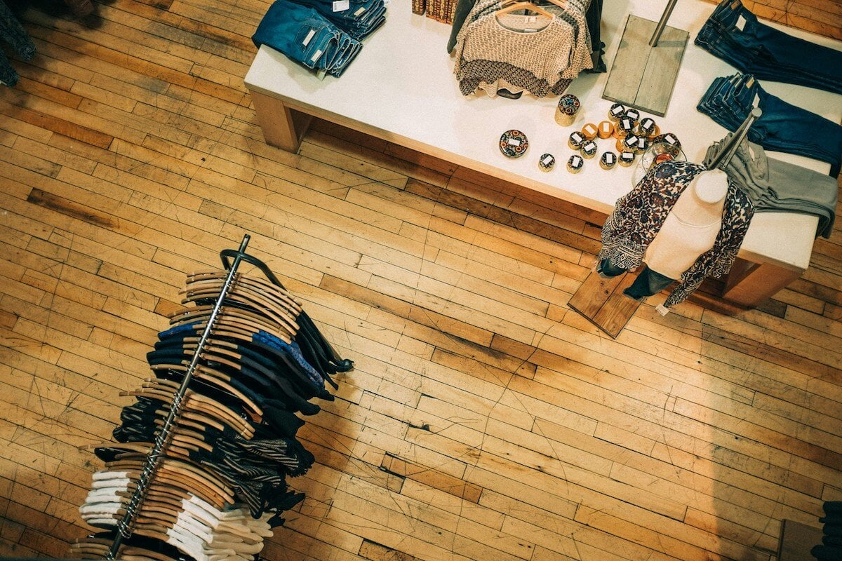
Visual merchandising mistakes to avoid
We asked Sarah what mistakes she sees smaller retailers make when it comes to their visual merchandising. Here’s what she’s noticed.
“I would say typically they tend to have too much out, so the quantity is probably wrong”, says Sarah. “If it's so heavy with product quantity, firstly it undervalues the product, and secondly, it makes it unshoppable. But if it’s too empty it can look like it’s been overshopped, so it’s all about the correct quantities and making sure it’s shoppable.”
She also finds the experience of shopping at smaller stores can feel a bit cramped. “I think often the floor layout can be slightly wrong. Particularly if they've got a small store, often it's quite cluttered, with lots of blocks to block the flow.”
To solve this, she recommends having a look at your customer flow, or how people actually move through your store. You should then review the product order to keep the customer interested throughout their whole journey, and draw them towards the quieter pockets of your shop.
“Also make sure that the product makes sense in regards to its package”, Sarah advises. “From a purchasing point of view, try to think about how you're going to get the customer to buy into that package of products, and then try to show them in store all together as a whole collection.”
An accessible way to craft a retail ‘experience’
“The High Street is changing to really adapt to that new customer trend of actually wanting less stock, more space, more of an experience, more natural elements in store, and more natural lighting”, says Sarah.


Two of the many 'looks' of the Anya Hindmarch concept store, a multi-sensory merchandising masterclass
But how can small independent retailers still create an ‘experience’, without the budget? Sarah had some advice there, too.
“From an independent retailer’s point of view, talking more about who they are, their ethos, where their products come from, and the importance of supporting them, all helps build a unique experience. Talk about that in your window, talk about it online, talk about it in store… it’s all about product stories and product ethos”, advises Sarah.
“You can create the same energy of a high budget “experience” just by being a great retailer.”
Working with Sarah
Sarah runs a number of brilliant visual merchandising courses which are designed to help retailers of all sizes feel more confident building great displays, and to get the most out of each item in their assortment.
You can book private online courses, or bespoke in-person sessions. Head to Sarah’s website to find out more, and follow her on Instagram @visualmerchandisingcourses for more fantastic visual merchandising tips.