Your shopfront is your first opportunity to make an impression on passers-by. So let’s make it a great one!
Whether you’re looking for fun and effective way to paint your shopfront, inspiration for window vunyls and decals, or deciding on a hanging sign, take inspiration from 15 of our favourite shopfront design ideas below, grouped by theme:
4 Types of shop frontage & signage ideas
Painted shopfront design ideas
There’s been a visible shift in shopfront trends over the last few years. What makes a chic shopfront has kind of come full circle — now, instead of illuminated, acrylic or metallic lettering, painted lettering is a lot more popular. Here are some of the CREOATE team’s favourites:
1. BookBar
BookBar is a bookshop (and bar! and cafe!) founded on the belief that bookshops should be social spaces primed for bookish chat with your best pals. The shopfront completely reflects this. The tonal colour choice is modern, fun and on-brand, while the lettering is clear and strong. We love how simple and striking it looks as a combo.
2. Know & Love
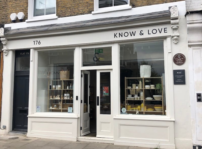
In stark contrast to BookBar, Know & Love opts for monochromatic simplicity with its shopfront signage, which lets the colourful window displays do all the talking.
3. What Mother Made
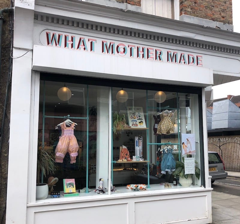
A few doors down, What Mother Made also opts for a plain white background. But unlike Know & Love, the lettering is anything but understated. Bold, eye-catching and downright funky, it really stands out among a street of subtle shopfronts.
4. Amoret
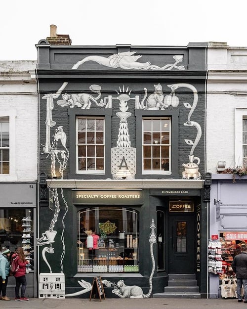
Source: Pinterest
Housed in a Notting Hill townhouse, Amoret Coffee Roasters' shopfront showcases a grand mural depicting Kaldi the goat-herder, an Ethiopian legend who discovered the stimulating effects of the coffee plant, as the story goes. The artwork is a collaboration between the shop's owner, Sadiq Merchant, and barista-turned-artist Tim Shaw.
5. Forest and the Flowers

Why paint your shop front one colour, when you can paint it two? Forest and the Flowers' bold shopfront stands out on a drizzly morning in Bristol.
📚 Bookmark for later: 20 Visual Merchandising Tips & Best Practices for 2024
Window vinyl sticker ideas
A fun window vinyl can complement your external shopfront signage, or replace it altogether. Here are three shopfronts where the vinyls steal the show:
1. Papersmiths
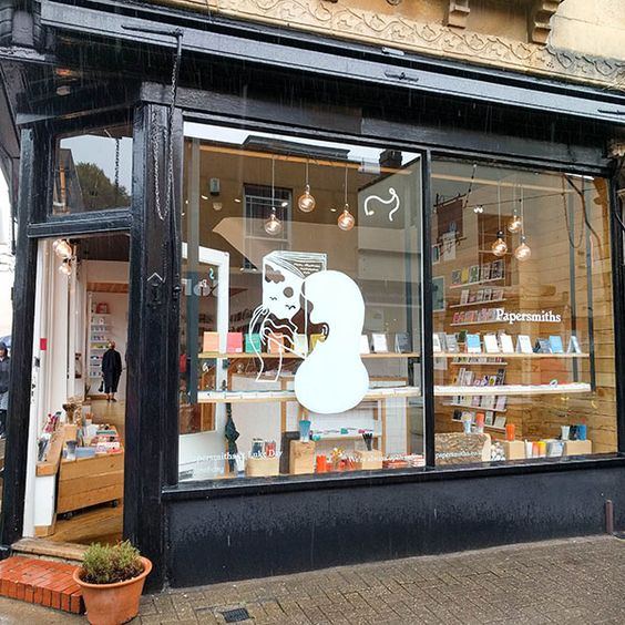
Source: Pinterest
Papersmiths’s Bristol branch is completely reliant on its vinyls for brand recognition. But with vinyls this good, that’s no bad thing.
2. Dowse
Dowse’s simple, slim text vinyl perfectly complements a bold and colourful window that’s over the top in all the right ways. There’s even room to pop in the shop’s strapline; ‘Created & Curated Goods’.
3. Hold
Hold has also used a vinyl to give a flavour of what customers can find within — ‘Objects for Home and Life’. But our favourite is the enlarged logo, and the way it casts a shadow on the blank wall behind.
4. Luna & Curious

Luna & Curious switches up their shop frontage with bright and seasonal window vinyl stickers.
📚 Bookmark for later: 21 Shop Window Design Ideas & Design Tips
Hanging shop sign ideas
Hanging shop signs can sometimes feel a little twee, but here are three brands proving that they absolutely don’t have to be:
1. Halt
Halt lets its signature olive green do the talking, leaving the logo almost as a secondary thought. We think it works really well.
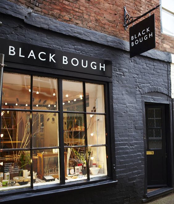
2. Black Bough
Source: Pinterest
Black Bough keeps things simple with a hanging shop sign that mirrors its painted shopfront to attract passersby from all angles.
3. Paint Box

Source: Pinterest
This sign for Paint Box is a great example of how to create a hanging sign that fits with your brand. It’s also perhaps a cautionary tale in placing style over practicality — there’s a whole Reddit thread dedicated to people who can only read this as ‘PAIB NOXT’.
3D Shop frontage ideas
Incorporating 3D and textured elements into your shopfront designs can add a unique twist to your brick-and-mortar that jumps out to passers-by by and adds an instantly recognisable symbol to your branding:
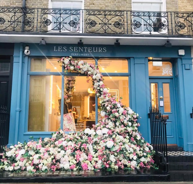
1. Les Senteurs
Source: Les Senteurs
This perfumery in Belgravia always has a fabulous display of flowers on their storefront. Here, a giant perfume bottle filled with flowers inside the store is styled to look like it has been sprayed, and the scent is so decadent it has seemingly escaped the store. The result? A dynamic, sweet-smelling 3-D storefront.
2. Summerill & Bishop
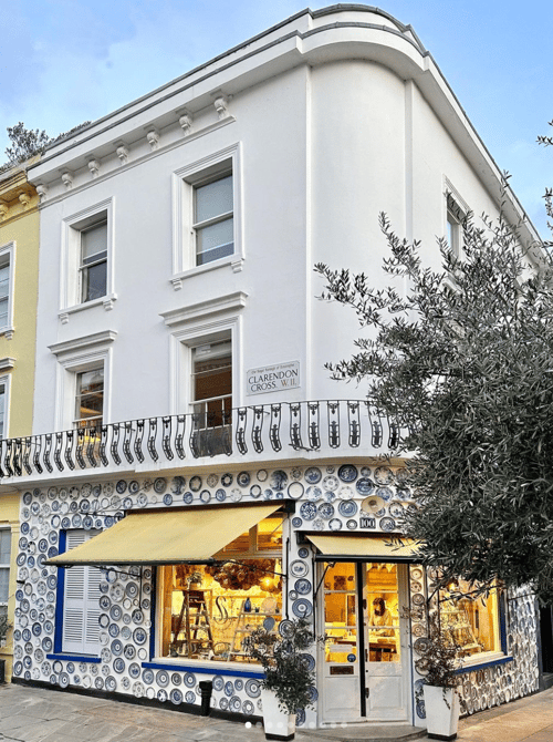
Summerill & Bishop is a home and tableware retailer in Holland Park, London. Their shopfront changes every few months, each highlighting a distinct art style that syncs with their current collection. For this window, they've taken inspiration from the streets of Lisbon, using secondhand china plates from charity shops to create this striking result.
3. Pedlars
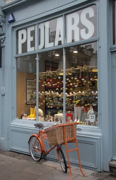
The Pedlars general store in Notting Hill focuses on colourful, British-made eclectic fare, and their storefront definitely reflects that. The orange bicycle in front of their shop adds a pop of eye-catching brightness against their dusty blue paint job.
📚 Bookmark for later: 13 Retail Store Layout & Customer Flow Tips
Looking for more inspo?
Us to! We're always on the lookout for more creative shop frontage design ideas to add to our collection. Email hannah@creoate.com if you have pictures of a lovely shopfront you want to shout out — no judgement if it’s your own!
Not registered with CREOATE yet? Sign up now and start shopping wholesale with us today.
FAQs
How can I make my shopfront attractive?
There are plenty of ways, to make your shopfront attractive, from 'quick wins' to longer-term projects. A fresh coat of bright paint does wonders for the outside of a shop, and a well-thought-out window display (using big and small objects sitting at different levels, creating a cohesive look) is always a good idea. An open door encourages people to step inside, and nice lighting and a 'decompression zone' (empty area) immediately in front of the door also makes 'popping in' a more appealing prospect.
📚 Bookmark for later: How to Increase Footfall In-Store: 15 Things to Try
How should I design my shop layout?
A beautiful storefront and shop window gets people through the door. But once they're there, how do you keep them browsing happily, and hopefully buying? Understanding how customers flow through a store, and familiarising yourself with common retail store layouts is a good place to start. Read our guide to retail store layouts and customer flow to get started.
What is shop frontage?
Shop frontage includes anything visible on the outside of a store, including the shop window(s), the shop facade, and any extra signage. In this post, we've focused less on shop window designs, giving more attention to the more 'permanent' elements on a shopfront. But if you're in search of window inspiration specifically, take a look at the posts below:
🎨 21 Window Display Ideas & Design Tips
🍂 17 Autumn Window Display Ideas


