


A typical ecommerce site gets more traffic from users on mobiles than on desktops, but more purchases coming from desktop; 1.7 times more on average, in fact.
So your mobile site presents a huge opportunity.
But it often slips off our radar because:
- We tend to work on our website from our laptops
- When we browse our site on mobile, we automatically know where everything is
- Editing the mobile version of your site, without affecting the desktop version, isn’t always a simple process
But with just a little TLC, we can get more of your mobile users to the point of making a purchase. It’s all about making your mobile site fast to load, easy to navigate, easy to trust, and quick to buy from.
Here are the 10 easy changes we’d recommend:
1. Remove interstitials for mobile users
Interstitials are pop-ups that open when you first land on a website, or click on a specific page. When used carefully for the desktop version of your site, they can be really effective. But on a smaller mobile screen, they’re annoying and really interfere with how the user interacts with the page. If you use pop-ups, either switch these off completely for mobile users, or change the mobile format to a slim banner, or something else that won’t obscure too much of the screen.
2. Add controls to your videos
Avoid autoplaying videos (they’re a nightmare for site speed, and for those quiet moments on public transport, as most of us have found out the hard way!). Add a pause/play button, as well as rewind and skip forward controls.
💡 Top tip: Always host your video on a third party website (such as YouTube or Vimeo), and then embed it onto your website. Otherwise, you’ll seriously slow your site down.
- YouTube is best if your video isn’t in a prominent place on the website, and the video is about something that people might be searching for on YouTube anyway
- Vimeo is best if you want a sleek design, so it’s better for promotional homepage videos (YouTube shows a lot of branding)
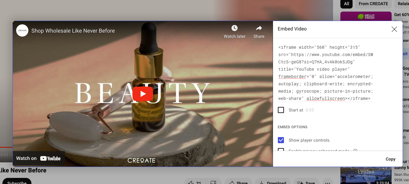
Make sure you select the ‘Show player controls’ option when copying your embed link
3. Swap background colour images for code
If you have a colour background on your website, make sure this is coded in, rather than one (or several) large image assets. It’s a small optimisation but one that can shave valuable split seconds off your site speed!
📚 Bookmark for later: 8 Easy Ways to Improve Your Ecommerce Site Speed
4. Reduce & space out written content
What looks like a short-ish paragraph on desktop is likely to show up as a big wall of text on mobile. If your ecommerce platform gives you the option to show different text to mobile users, consider slimming this down (or at the very least spacing it out) for your mobile version.
How to make content easier to skim and scan on mobile:
- Reduce the overall length of content with a brutal edit
- Break it up into smaller paragraphs
- Use bullet points & clear headings
- Sprinkle in some emojis (sparingly!) if they’re a good fit for your brand
- Image captions are often the most read item on a page, so make the most of them
💡 Top tip: Some ecommerce platforms (like Squarespace) make it really easy to switch to the mobile version of your site, and edit this without affecting the desktop version. On Shopify, it can be a bit trickier, and you’re a bit reliant on what your specific theme, or each specific module, allows. This thread is a helpful place to start.
📚 Bookmark for later: How to Build Topical Authority with Your Blog & Write for the Web
5. Offer Apple & Google Pay
With Google and Apple pay, your customers can pay for their purchases at lightning speed. It’s a great way to make their journey smoother, and tip a casual browse into an accidental impulse purchase.
Mobile users have the highest cart abandonment rate, so anything you can do to reduce friction during the checkout process should be a top priority, and this is a great place to start.
6. Provide a guest checkout option
Having to fill in everything from your address to your first pet’s birthday is a surefire way to take us from ‘why not treat myself’ mode to ‘hmmm, I’ll go away and have a think about it’ mode, never to return to that online store again.
As we mentioned already, reducing friction on mobile is key. Offering a guest checkout option speeds up the new customer experience (or at least, is perceived to), and means you’ll capture far more impulse purchasers.
It’s also a question of data collection and customer trust. A recent survey found 85% of British shoppers say the guest checkout option is either ‘somewhat’ or ‘very’ important to them when shopping with new brands, but for the reason of ‘gaining their trust as new customers’, rather than speeding things along.
7. Offer an easy way to zoom in on images
Getting into the details is important, whichever device you’re on. Your customers are used to double tapping or pinching images in order to zoom in on mobile, so make sure you’re offering a familiar way for them to get down into the details of your products.
8. Make the search function easy to find
Even with the most intuitive design, navigating around an ecommerce website on mobile is harder than on desktop, which makes your search bar all the more important.
So first, make sure you have one! And second, make sure it’s easy to find — ideally displayed ‘above the fold’, i.e. visible when a user first lands on your site, before they start scrolling.

Easy search is essential for an online bookstore, where users will often arrive with a specific author or book in mind. Bookshop.org manages to squeeze in a full search bar on mobile, rather than just a magnifying glass icon
9. Consider alternatives to dropdowns for product variations
Dropdown menus conceal the available options, so are generally considered a last resort when it comes to good mobile User Experience (UX). Experiment with other ways to present variables like colour, finish, and number of products, such as radio buttons, or steppers.
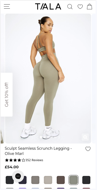
Shopify-made site TALA doesn't conceal colour or size details in dropdowns. Instead, all the information is there for the customer to choose from
10. Add extra trust signals
How we shop on desktop is different to how we shop on mobile.
On desktop, we’re more likely to do some research (either on the site itself, or by reading reviews from third party sites, or both) to reassure us that we’re buying a good, trusted product.
On mobile, it’s even more important that your potential customers have enough information to trust your brand, without having to leave your site. Their attention span is short (they’re having a quick scroll while the kettle boils, or before their train pulls into the station), and they may never have heard of you before today, having found you through a social media swipe up link, an ad, or a search listing.
With reports of internet-based crimes having skyrocketed over the past four to five years, people are rightfully wary.
An easy way to gain customer trust is to really showcase reviews and ratings in as many places as possible. Studies have proven that we trust the opinion of our fellow shoppers more than almost anything else; in fact, 92% of people feel hesitant to buy when they can’t see any customer reviews.
💡 Top tip: Proactively collect more reviews from your existing customers by setting up an automation to request them a set time after their product has arrived.
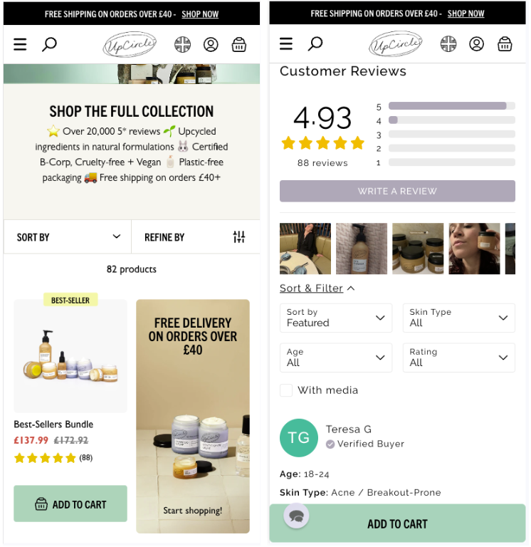
Many UpCircle products have several hundred reviews, and they're overwhelmingly positive, and UpCircle does a great job of making the most of them, even providing ways for customers to filter through the reviews and find what's most relevant to them
How to check whether your website is mobile-friendly
The most useful thing you can do to assess how mobile-friendly your website is is just to carve out time to test it yourself, and ask friends and family to do the same.
The qualitative feedback you can gather in this way is so valuable to understanding how people naturally use your website from their mobiles, and where any pain points are.
But beyond this, there are a few tools that can help:
- Google Search Console. Head to Page Experience > Mobile Usability to see how Google rates your pages for mobile, and any suggestions for improvements.
- mobiReady. A free tool for assessing the mobile friendliness of your website (as an alternative to Google Search Console). We love how this tool breaks your results down into ‘Major Fails’, ‘Minor Fails’, and ‘Passes’. It also shows your website as it would display on multiple different phone screen sizes.
- Hotjar. Use Hotjar to create heat maps of where users are clicking on your website, and where they’re getting stuck. You can also view individual user sessions to better understand how people browse.
Wrapping up
When creating this list of ways to optimise your mobile ecommerce site, we’ve focused on what we believe will add real value, and be achievable in a short space of time, and using the ecommerce platforms our CREOATE community prefer (*cough* Shopify *cough*).
An afternoon of dedication to your mobile site is all you need to start turning those casual browsers into buyers. But the journey doesn’t stop there.
Your mobile site is never ‘finished’, so make sure you’re staying close to your own data to see what’s moving the needle, and what’s not. And going forward, make sure you thoroughly check website updates on your mobile, as well as your laptop.


