Think of your ecommerce site’s navigation is the final thread that weaves all your hard work together.
You need people to easily find your products and (hopefully!) buy them. And you need to do it in an SEO-friendly way.
But before we jump into nailing your ecommerce site navigation, be sure to take a look at our guide to planning your product categories, as this is ultimately the first step in building out a seamless site navigation.
📚 Start here: How to Plan Your Product Categories in a Sustainable Way
Going forward, we’ll assume you’re already happy with how your ecommerce site is structured. So now, it’s about getting people (and Google’s bots) flowing through it as painlessly and intuitively as possible.
5 Ways to nail your site navigation:
- Build a comprehensive menu
- Create a simple site map
- Leave a trail with digital breadcrumbs
- Add plenty of internal links
- Optimise for click-through rate
1. Build a comprehensive menu
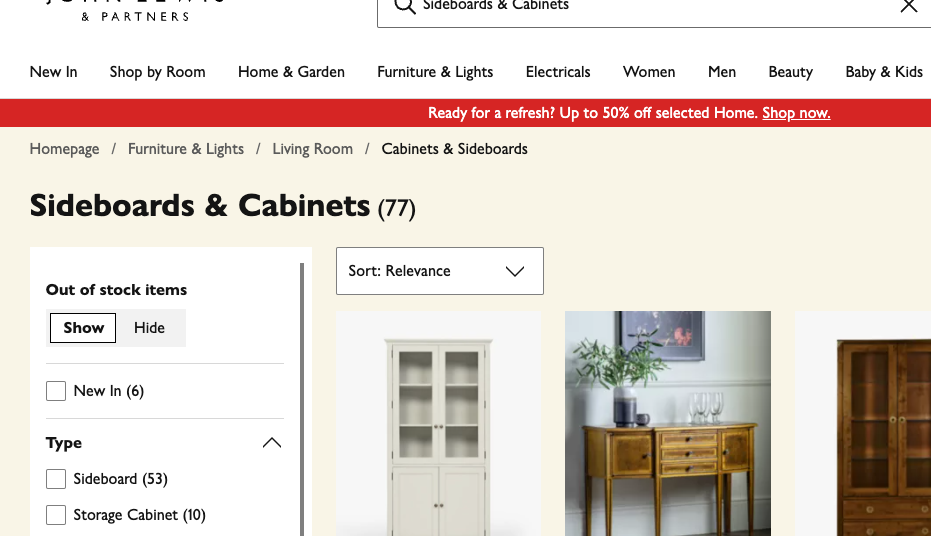
You should ideally include all your categories (parent and sub) in your top menu. In this example from John Lewis, the parent categories are visible in the top bar menu, and the subcategories appear when you hover over them.
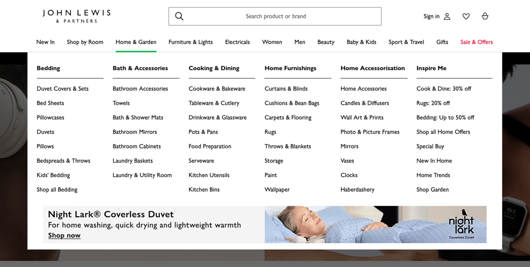
The John Lewis menu is simple and effective, managing to condense a vast number of categories into a user-friendly experience
And notice how the ‘Offers’ section jumps out within each parent category?
Moving across to mobile, and you can see John Lewis has opted for a hamburger menu (the logical option for such a broad range of categories).
Knowing that the three-click rule won’t be possible here for mobile (the screen is simply too small to include all those categories), a strong above-the-fold search function is all the more important, including a clear space for customers to search something specific.
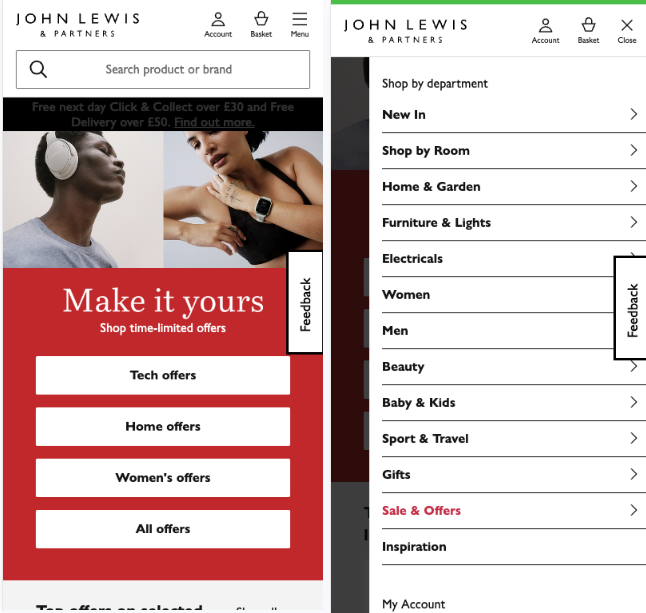
When space is limited (as on mobile), make your above-the-fold choices (i.e. what you see before scrolling) as strong as possible
💡 Quick reminder on the 3-click rule: The 3-click rule says that no significant page (e.g. category, or subcategory) should be more than three clicks away from the homepage. This works better for search engines, and for your customers.
📚 Bookmark for later: 10 Easy Optimisations for Your Mobile Ecommerce Site
2. Create a simple site map
As well as including all your categories in your menu, you want to make what’s known as a site map with links to all your product categories, and any other key pages, like ‘collections’ (cross-category product selections grouped by theme, like ‘Back to school’).
The term site map might sound fancy, but we’re actually talking about a really simple page here. It doesn’t need to be anything special — it’s unlikely any customers will actually use it — it’s just another way to help make sure Google crawls these pages by providing all the links in a simple format, one click away from the homepage.
Here’s an example from Materials Market (note that each page mentioned is hyperlinked, which is essential for this to work as intended):
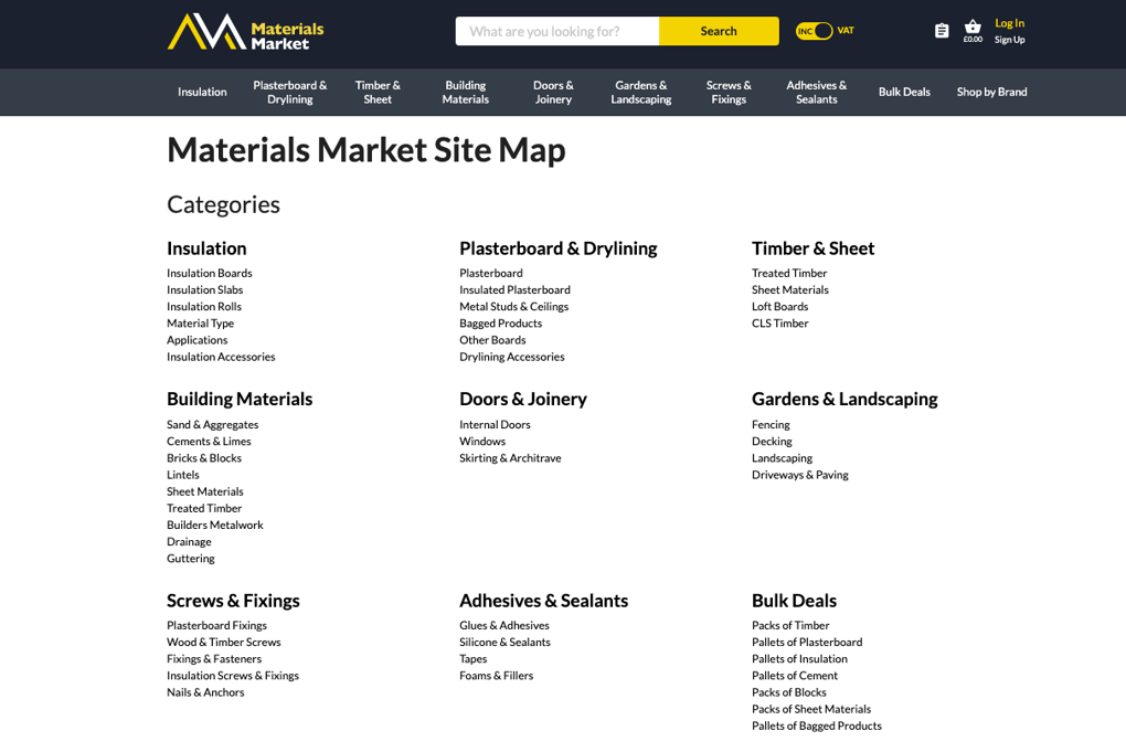
Once you’ve created your site map, pop it in your website footer with the anchor text (hyperlinked text) ‘Site map’.
3. Leave a digital trail with breadcrumbs
In website terms, breadcrumbs show the user a trail of how they arrived at where they are on a website, giving them an easy way to jump back a step if they need to, without having to rely solely on their back button. And yes, it’s good for your SEO, too.
Let’s go back to John Lewis to see an example of breadcrumbs in action:
The breadcrumbs are located under the top section of content, giving you options to jump back to ‘Home’, ‘Furniture & Lights’, or ‘Living Room’ within ‘Furniture and Lights’
4. Add plenty of internal links
Each of your category pages should have a description of at least 300 words where you can cover any questions about this product category.
Within this text, be sure to mention (and link out to) a few other key categories. This helps your site’s authority to percolate around the different site pages, and introduces your customer to complementary categories and items.
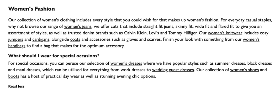
Women’s Fashion is one of John Lewis’s parent categories. Within the category description, they’ve added links out to several subcategories within the parent category
5. Optimise for click-through rate
So far we’ve focused on optimising navigation when people are already on your site. But there are a few things you can do to encourage easy navigation through from the search engine results page.
Sitelinks (& how to encourage them)
When you search for an ecommerce brand on Google, you’ll often notice specific links appearing underneath the main homepage, which are known as ‘sitelinks’.
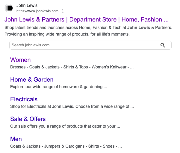
These links are called ‘sitelinks’, and they’re chosen by Google based on what it thinks people searching for said brand will want to see
Sitelinks are a good thing. They mean your search result takes up more space, and gives people more reasons to click on your site, as well as an easier route to something they may be looking for.
And while Google ultimately suggests whether or not sitelinks are included for your brand, and if so which links, and which descriptions for these links, there are some things you can do to encourage specific links to appear here:
How to encourage specific sitelinks to appear:
- Add more internal links to these pages. As a general rule, the more links you add towards these pages, the more likely they’ll be to appear as sitelinks (as long as you’re doing it in a natural, non-spammy way).
- Make sure these pages are linked to from the homepage. In Google’s eyes, your homepage is your most powerful page, and therefore links from here are the most powerful signal.
- Promote these pages across other channels. The more popular Google sees these pages are, the more likely it is that they’ll be promoted to sitelinks.
- Make the content on these pages really strong. You want over 300 words of quality written content, and engaging, keyword-optimised meta information.
- Demote other pages that are getting in the way. You can ask Google to ‘demote’ a sitelink if you think it’s not a useful one to show, which can make room for a sitelink you’d rather display. Follow the steps below to request this.
How to request to demote a sitelink:
- Go to Google Search Console
- Under Search Appearance, click ‘Sitelinks’
- Add the link for the page you don’t want to appear as a sitelink, then click ‘Demote’
Include relevant types of schema markup
‘Schema markup’ is essentially a set format of code written to help Google understand exactly what it’s looking at when it comes across your website.
Because while we talk about Google ‘reading’ or ‘reviewing’ your website, what we’re actually talking about is bots crawling your website and trying to understand it based on their own programming — no eyes, ears, or cognitive ability to help them out.
So with all the different website formats and designs out there, schema markup exists to cut through the noise for bots and spell it out loud and clear: this is a product for sale, this is a price, this is a star review, and so on.
A typical ecommerce website is likely to need the following type of schema markup:
- Product schema
- Price schema
- Breadcrumb schema
- Review schema (if you show reviews)
- Product availability schema (if you show product availability messages)
📚 Bookmark for later: 6 Changes to Make on Your Product Pages (for SEO)
When implemented correctly, having these types of schema markup in place can also really jazz up how your products look in the search results:
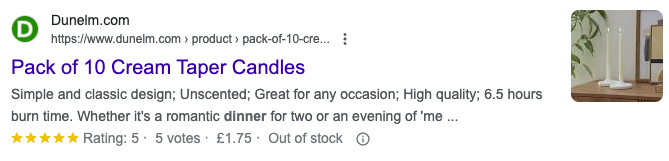
This pack of candles only ranks in seventh place for the term ‘taper candles’, but we’d be willing to bet it gets more than its fair share of clicks due to all the information you can see before you even open the page. No wonder they're out of stock!
Wrapping up
It’s easy for you to find things on your website: you know where they are, after all. When planning your navigation, always try to imagine yourself as a customer who’s totally new to your site, and impatient to get to what they’re looking for. They’re having a quick scroll while the kettle boils, or when they’re in line at the Post Office; if they can’t find what they need, they’ll be off (and Google is basically just as impatient)
If you had a physical store, we bet you’d spend time obsessing over the perfect layout. Try to treat your ecommerce site’s navigation and structure with the same care and attention. And always be switching it up based on what’s seasonal, and what’s popular.
Not shopping wholesale through CREOATE yet? Create an account today to shop thousands of independent brands, all in one place.